If you’re ever in a situation where you need to be heard, put up a sign. Those seem to be working quite effectively on the internet. There is a caveat though: they have to be funny.
And hey, if you do well enough, you might end up on one of the myriad of social media groups or pages, like the Really Funny Signs group on Facebook. Then your message will be seen. It will also be shared and reshared on the internet with questionable results as to whether whatever that you said in the sign was actually heard or fulfilled.
#1

Image credits: Steve Brunner
#2
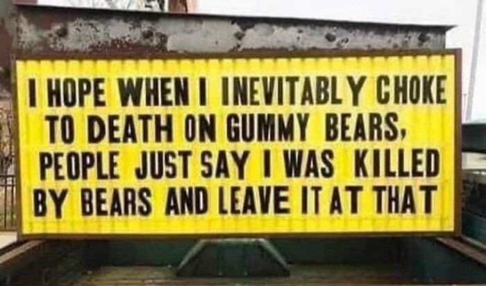
Image credits: Kathy Hickey
#3

Image credits: Eric Draven
Really Funny Signs is a Facebook group that’s always on the lookout for signs that are somehow off. It can be poor placement, mayhaps it can be an unfortunate truncation of words or poor choice of font, or it can be just humorous in its own right. Whatever the case, they have it, they spot it, they share it.
The public group has gathered nearly 93,000 members since its inception two years ago and the community is rather active, having shared nearly 700 posts just this past month.
#4
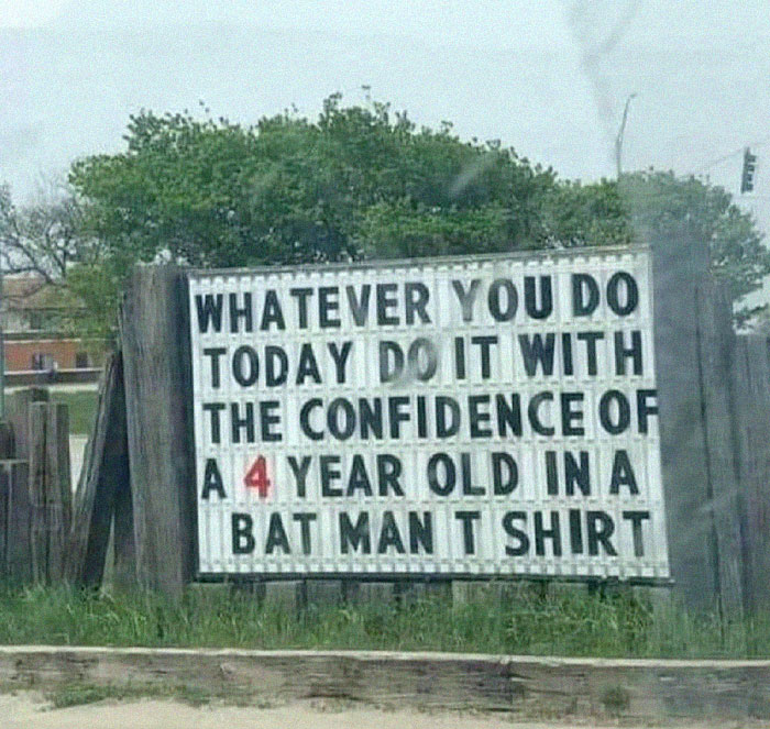
Image credits: Eric Bruckner
#5
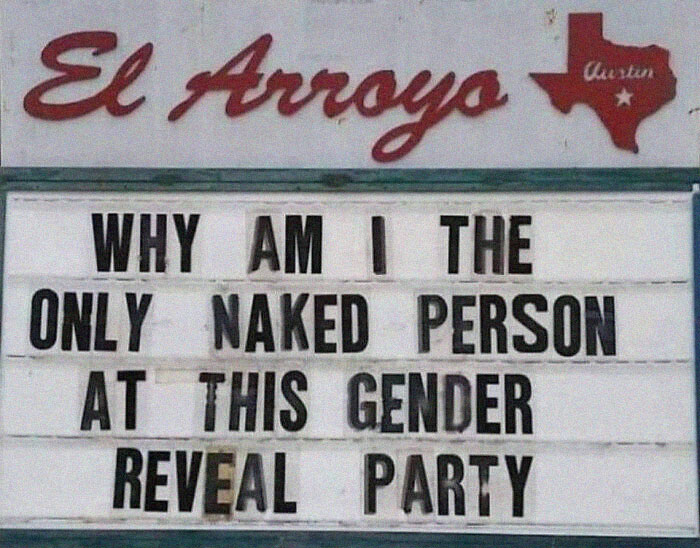
Image credits: Warren Woywood
#6
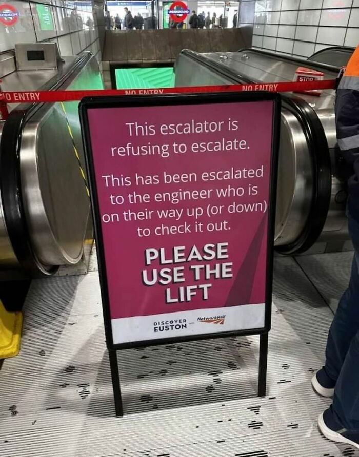
Image credits: John Nole
It goes without saying that signs matter. But wait, there are a lot of things that also matter. Yes, there are, but when you think of things that seem very normal, everyday, mundane even, you often don’t think they matter. But they do.
Entrepreneur Andy Simpson exemplified this in a LinkedIn post of his by highlighting 7 important statistics of why signs are important.
#7

Image credits: Steve Brunner
#8
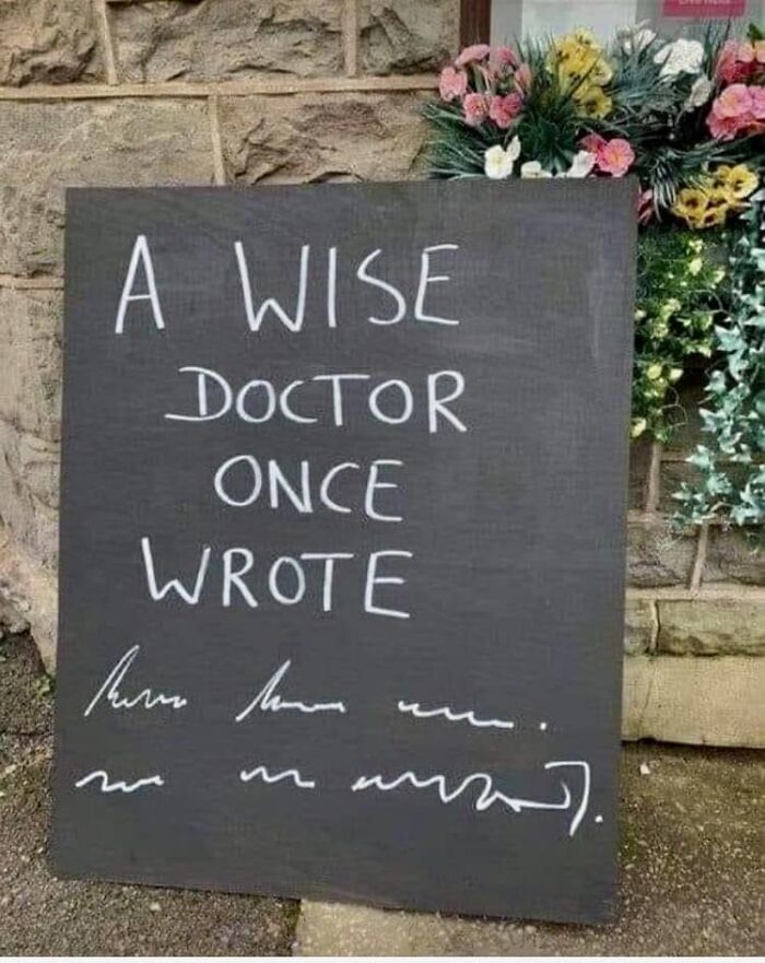
Image credits: Diane Quinn
#9
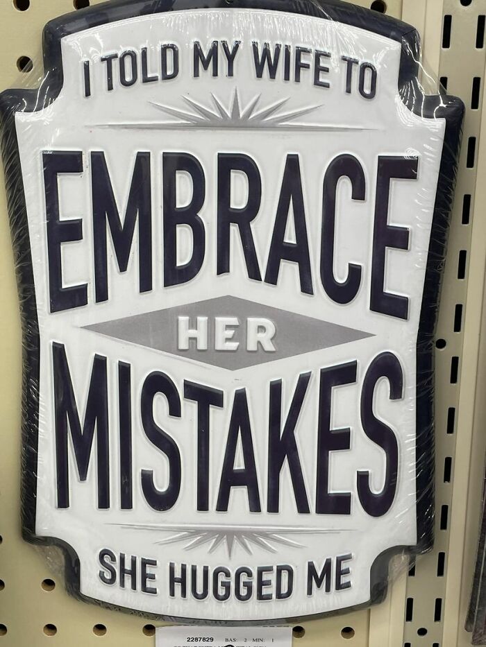
Image credits: Eugene Ballinge'r
According to a FedEx Office survey, a tad bit over three-quarters (76%) of consumers said that they have entered a store that they have never visited before based on its sign (or signs).
Exterior signage can go a long way in communicating the right things to the right audiences, immediately telling them who the store is, what it deals in, as well as inviting them to take a gander inside.
#10

Image credits: Jodi Lewis
#11
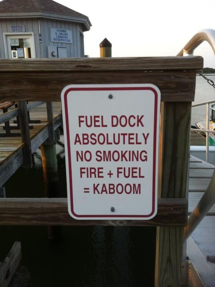
Image credits: John Berkos Flisk
#12

Image credits: Sebastian Wanner
Nearly 7 of 10 consumers (68%) have been reported buying something just because a sign has caught their eye.
It’s only appropriate to echo your fantastic product or service in your signage and to guide folks to where it’s at. Posters, pavement signage and other point of sale signs can go a long way in explaining what a business has on offer and where this pleasure can be acquired for cold hard legal tender.
#13

Image credits: Warren Woywood
#14

Image credits: Bob Hutch Hutchinson
#15

Image credits: Eric Draven
The same number of people (68%) also believe that a store’s sign reflects the quality of the product.
Just like a good product should be echoed in the sign, the same can be said about when a sign is sloppy as it gives off a vibe that everything else that follows will likely suck too. First impressions count, so make sure the sign is professionally crafted and it properly represents a good product.
#16
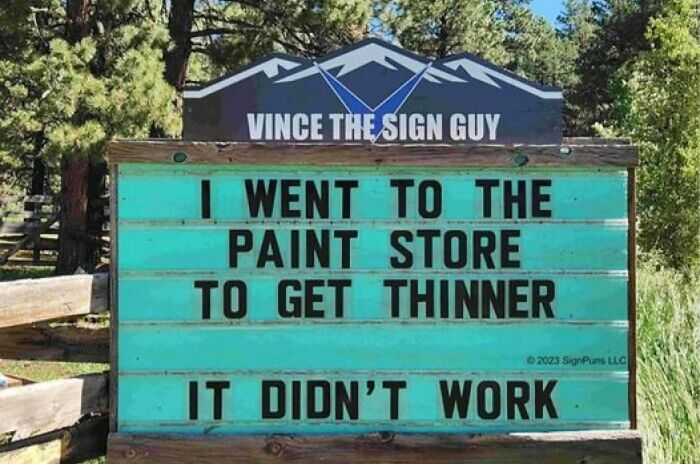
Image credits: Rosario Coloma
#17
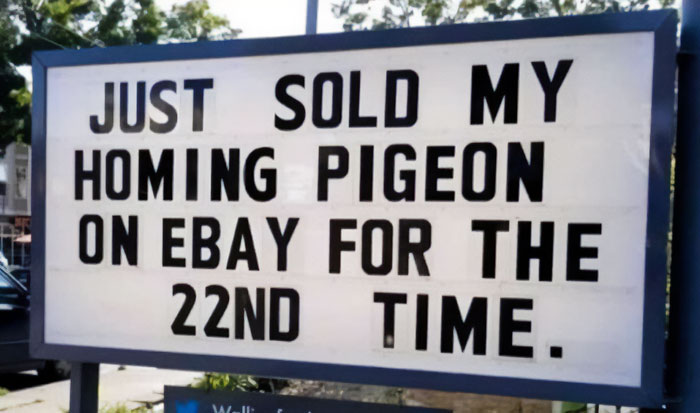
Image credits: Jodi Lewis
#18
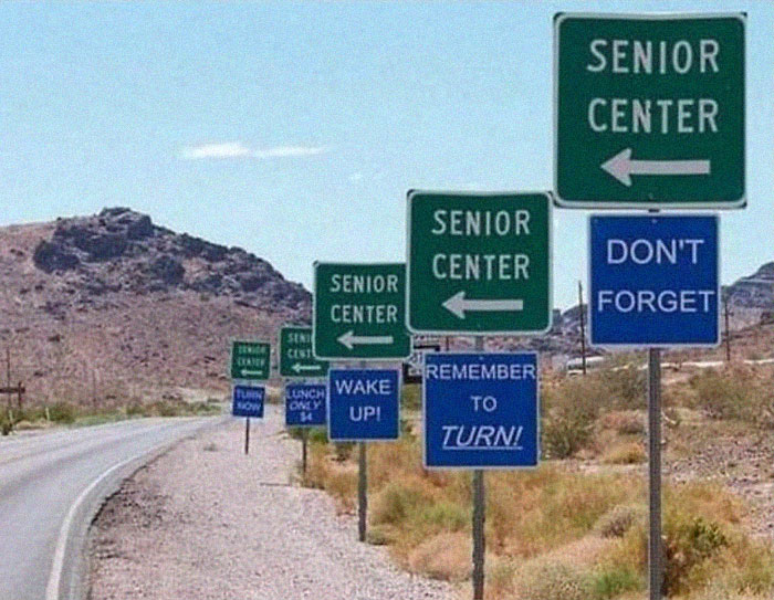
Image credits: Sherry Rosenkrantz
A whopping 85% of consumers reported that bright and colorful signs were more effective in drawing them in.
Why do you think most candy is bright and colorful? It embeds that which is sweet and further deepens our desire to throw money at it. Not only that, but a bright sign stands out in many environments where the color saturation is stylistically stronger, but it also hence loses some of the associated mood and emotion that brighter colors boost.
#19
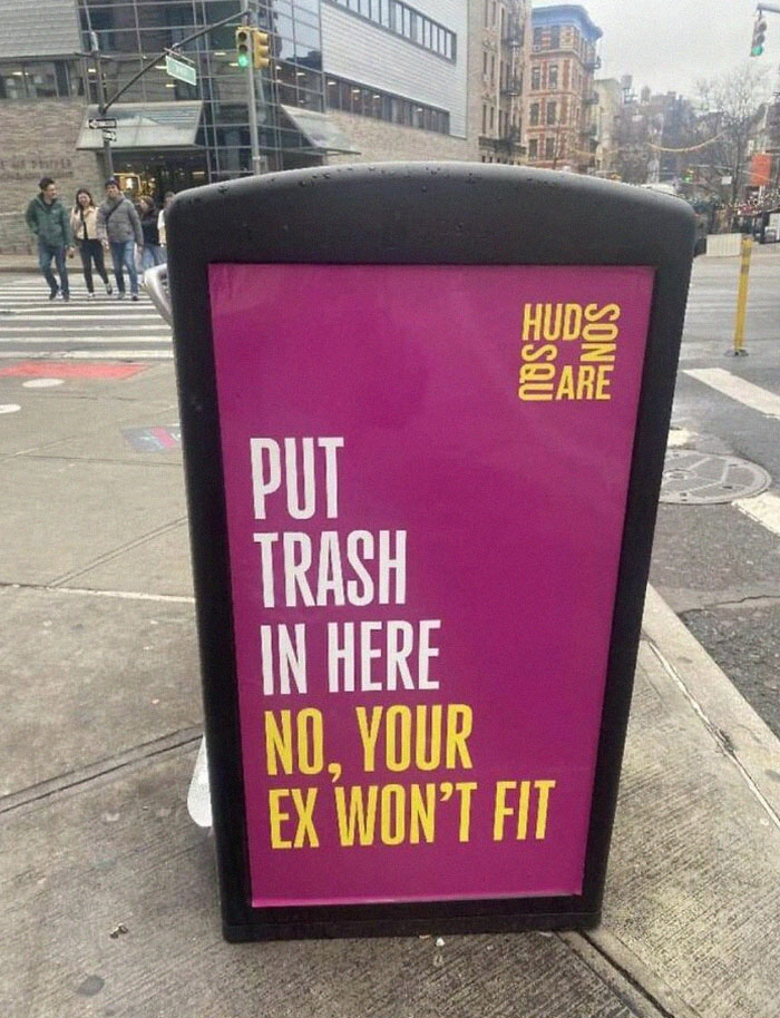
Image credits: Rosario Coloma
#20
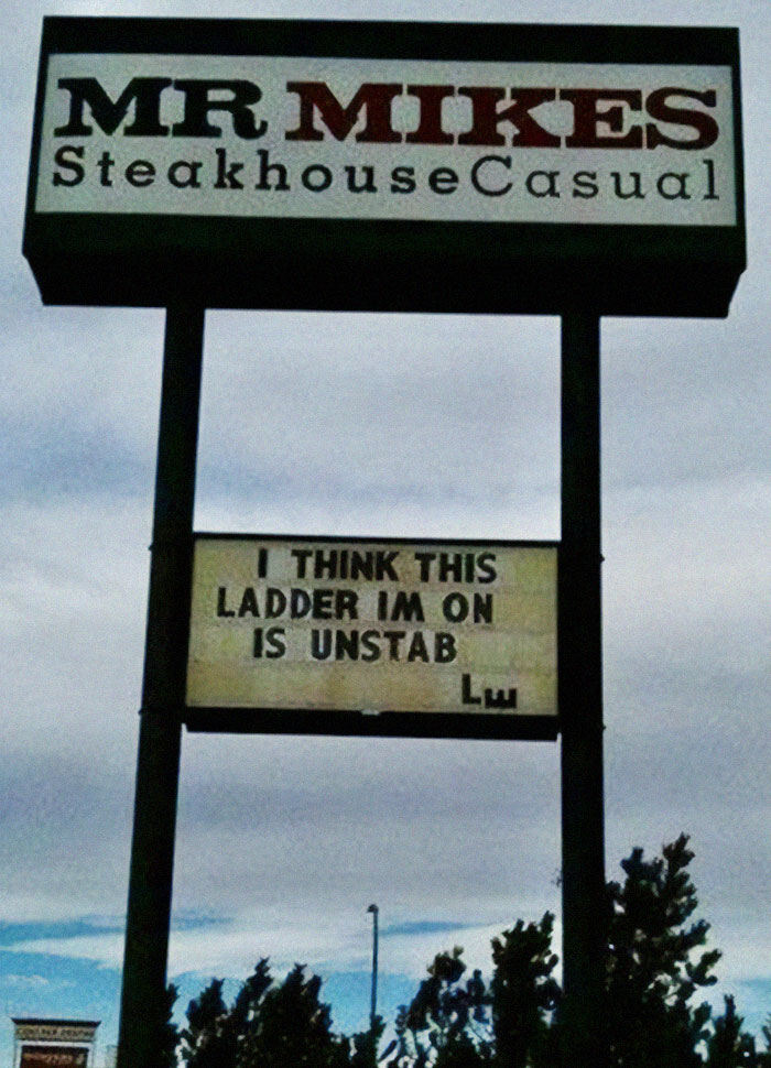
Image credits: Steve Brunner
#21
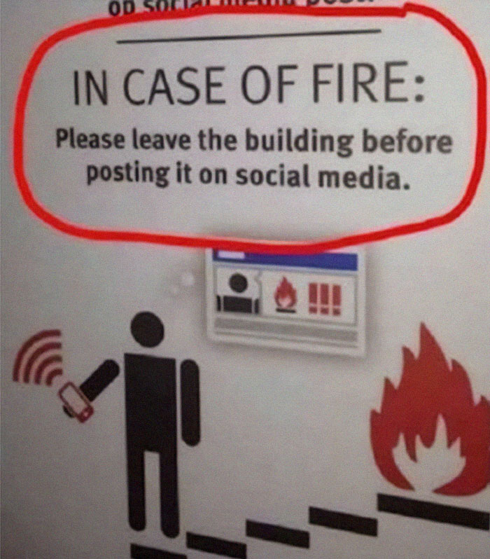
Image credits: Matt Donnelly
Signs are strong enough measures to net you a personal recommendation, according to roughly 75% of consumers.
If you see a logo or other piece of branding for yourself that leaves a mark, you’re bound to share it with others. Graphics and stick in people’s minds are more likely to become a word-of-mouth bit of advertising—even if it’s just one time that they will come over out of curiosity, but it will still have done its job, so make use of that!
#22
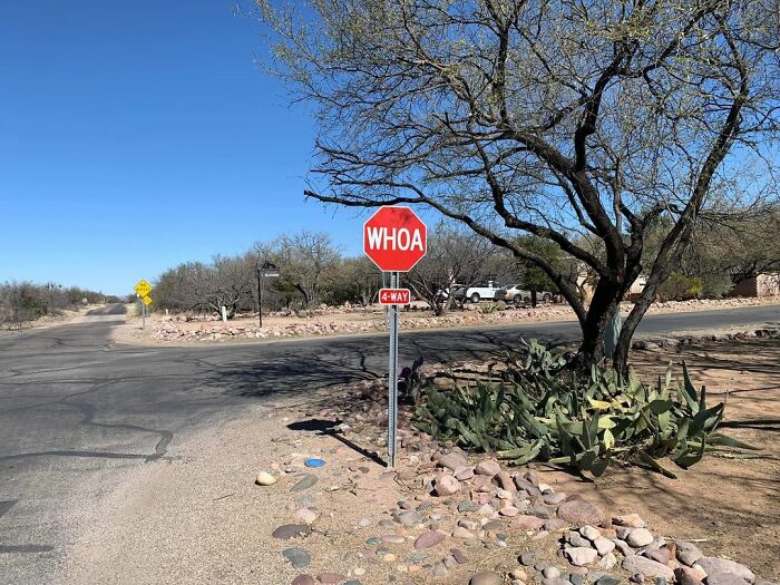
Image credits: Bob Hutch Hutchinson
#23

Image credits: Sebastian Wanner
#24
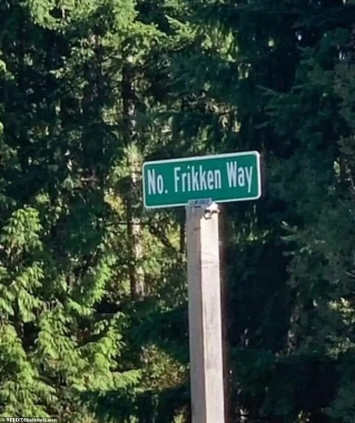
Image credits: Robert Jones
You might be surprised to know that legibility is considered by consumers and businesses alike as the most important characteristic in signage.
And why not—if a sign is easy to read, digestible, with its font, colors, and background, it has a higher chance of speaking volumes to potential customers. That’s why it’s important to hire a graphic designer who knows their stuff as opposed to asking your nephew who’s good at crafting memes. Good skill set, not an appropriate one, though.
#25

Image credits: Angela Sunshine Price
#26
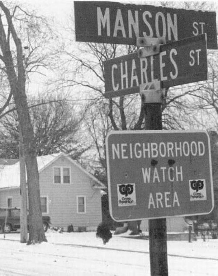
Image credits: Lydia Padilla Colon
#27
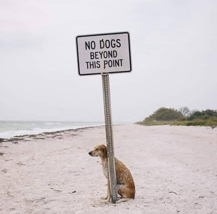
Image credits: Eric Bruckner
Lastly, 3 in 5 businesses reported that changing the visibility or design of a sign had a positive effect on their sales, increasing on average by 10%.
In the long run, the logo might blend into the background, so updating or switching up the logo with time helps to stay fresh and relevant among consumers.
#28
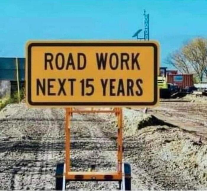
Image credits: Nancy Berto
#29

Image credits: Stephen M Brown
#30

Image credits: Christy Mantle Axelrod
So, what are your thoughts on any of this? Do you think we need more hilarious signs out there? Share your takes and stories in the comment section below!
And if you genuinely are in need of more funny signs, you can try this on for size.
#31
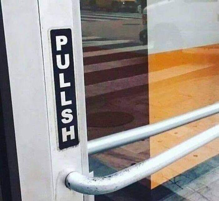
Image credits: Angela Sunshine Price
#32
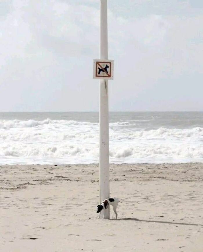
Image credits: Jeanne Sue
#33
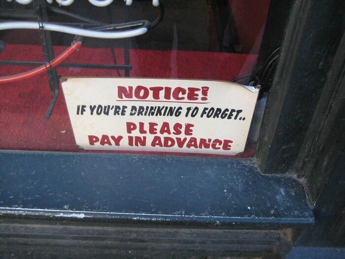
Image credits: Bob Hutch Hutchinson
#34

Image credits: Eric Draven
#35
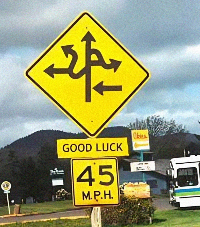
Image credits: Phanna Boukhz
#36
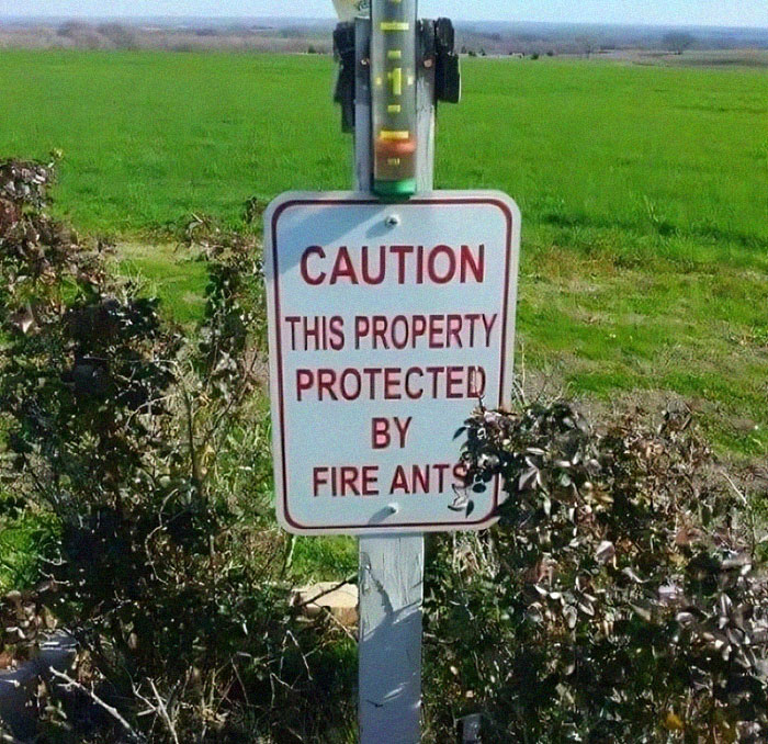
Image credits: Connie Wickwire
#37
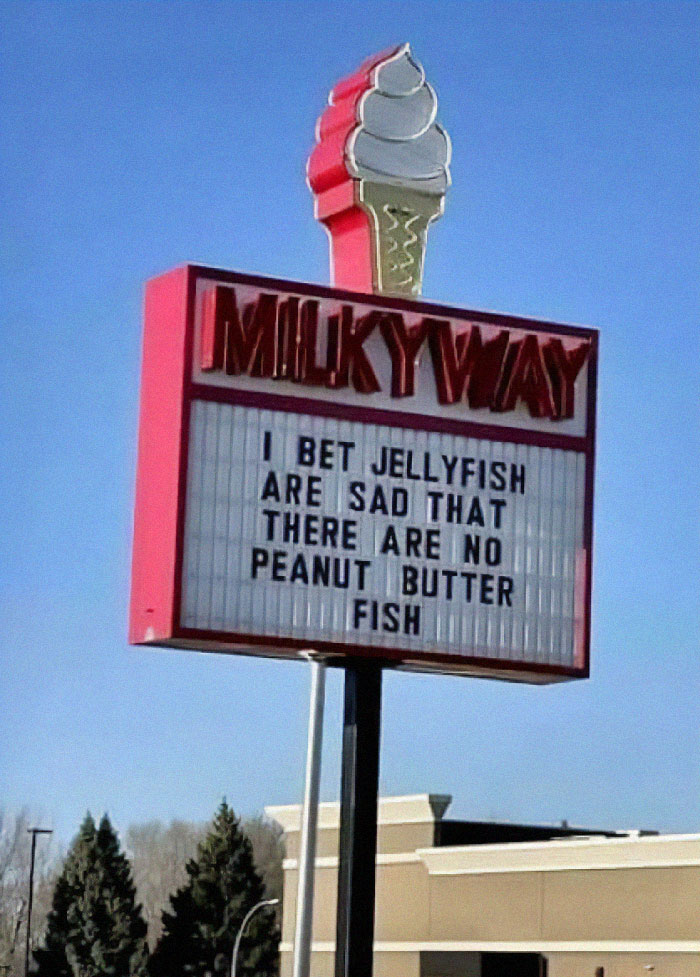
Image credits: Connie Wickwire
#38

Image credits: Patricia Ouellette
#39

Image credits: Steve Brunner
#40
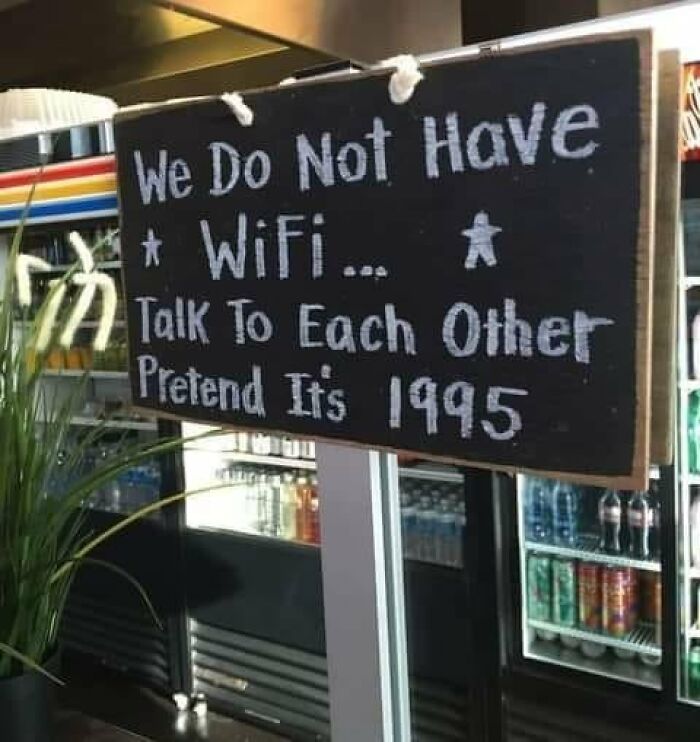
Image credits: Sebastian Wanner
#41
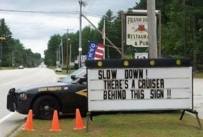
Image credits: Eric Bruckner
#42

Image credits: Eric Draven
#43

Image credits: Warren Woywood
#44

Image credits: Dena Nelson
#45
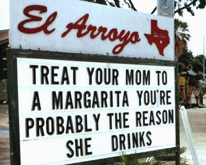
Image credits: Sherry Rosenkrantz
#46

Image credits: Eric Draven
#47
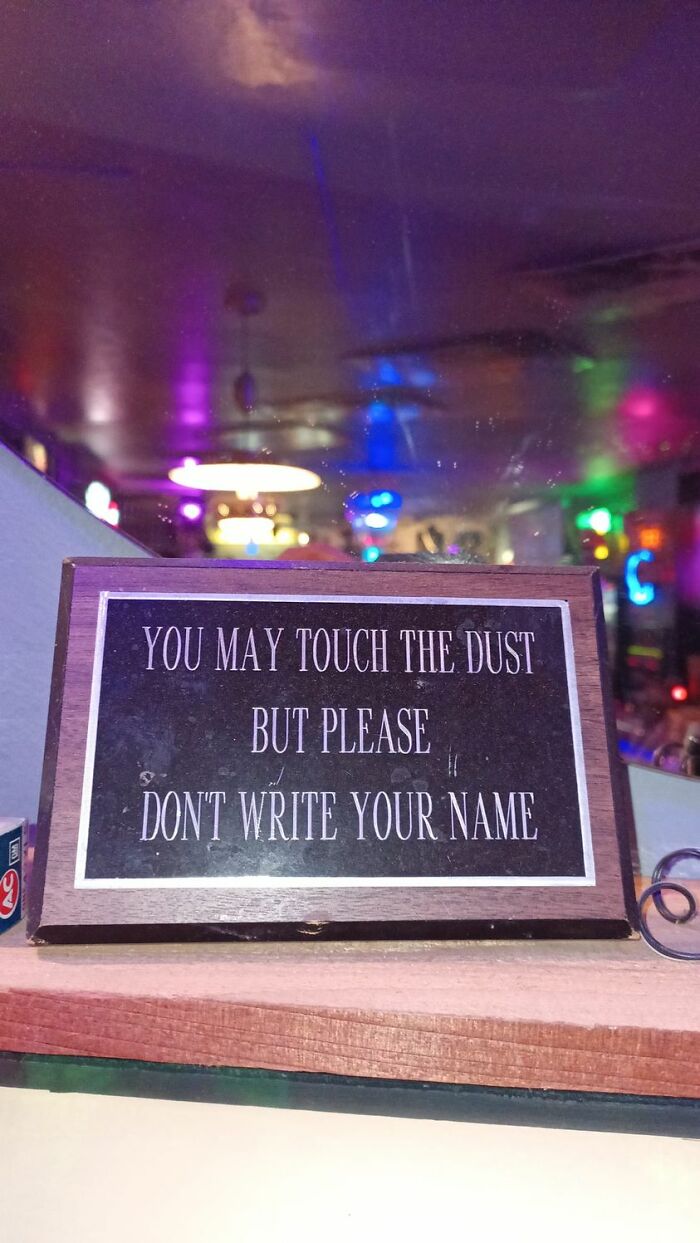
Image credits: Kurt Adams
#48
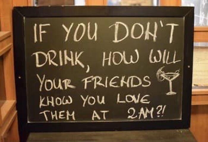
Image credits: Stephen M Brown
#49

Image credits: Sebastian Wanner
#50
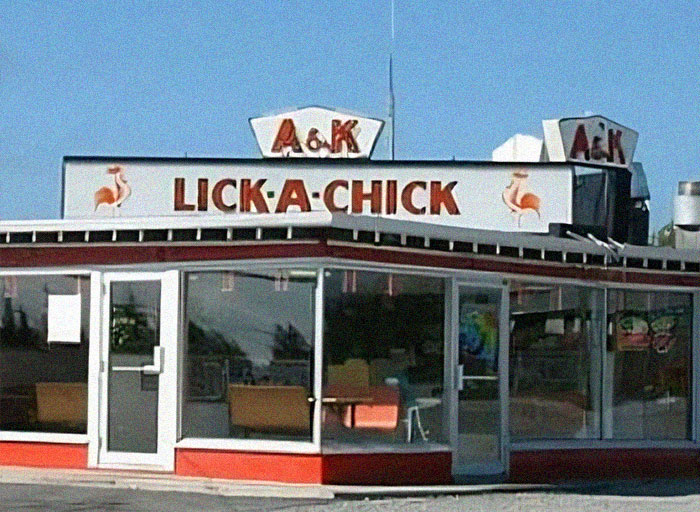
Image credits: Patricia Ouellette
from Bored Panda https://ift.tt/hSCBxoN
via Boredpanda
